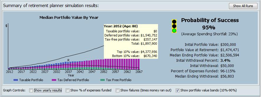
The center panel of the planner’s display will be filled with the simulation results after a successful run of the simulation. The output of this planner is a bit different from other “calculator” type planning tools. Instead of displaying an algorithmically derived output for each year, the results show the average each year for of all of the data that was calculated during each of the 10,000 simulation trials. In this way, the data shown for each year (and overall) doesn’t represent any one trial of the simulation, but rather the aggregate (usually the average) of all of the data that resulted from running through the simulation over and over.
Probability of Success
The first thing to notice in the results is the Probability of Success. The probability of success shows the percent of simulation iterations in which the investment portfolio had at least some money in it at the end of the plan. A successful retirement is defined as one in which you don’t run out of money and you have enough to pay your expenses. In very general and rough terms, most retirement planners would consider a probability of success that was below 75% to be a failed plan. That would mean that in one out of four cases, their client would run out of money during retirement. Even a probability of success above 75% doesn’t get a green light. The green light on the simulation traffic light is reserved for those plans that have a probability of success above 90%. Note however, that even with a 90% probability of success, one out of 10 people would experience problems with their retirement finances.
Average Spending Shortfall
Along with probability of success, another important output is the size of the shortfall for those simulation iterations where the plan failed (ran out of money). A plan with a reasonably high probability of success that usually fails in the early years may be less robust than a plan with a lower probability of success that usually fails near the end of the plan. The Average Spending Shortfall shows the average percent of total planned retirement spending that couldn’t be funded in those simulation iterations that failed. For example, consider a retirement plan with level spending planned for 40 years. Further, assume that when the retirement plan fails, on average it fails in simulation year 30. Such a plan would have an average spending shortfall of 25%. This is because on average 1/4 of the retirement plan’s spending wouldn’t get funded in those iterations that failed. Note that for a plan with a 90% probability of success, 90% of the iterations had no shortfall at all. The shortfall depicted by the average spending shortfall only applies to the iterations where the plan failed (eg 10% of iterations in the case of a 90% probability plan). For an example of how a plan’s inputs can affect the magnitude of the spending shortfall, run a plan with an “aggressive” investing style, then rerun it with a “risk averse” style and notice the change in average spending shortfall.
Percent of Expenses Funded
Another factor that goes into the decision of whether a plan is robust is the percent of the requested annual spending that the plan is able to fund. Because of the way the simulation handles spending when using the flexible or conservative spending policies, it’s possible for an iteration to complete with money left in the portfolio, yet the retiree’s spending needs were not fully met. This is because the flexible and conservative spending policies prioritize portfolio survival above annual spending needs. Consider a case where in order to keep the portfolio from being depleted, the simulation only funded the requested expenses at 40% in some years. Clearly, this would be considered a failure by most. In order to get a green light, the simulation must end with a positive portfolio balance over 90% of the time, and it must (more often than not) give the retiree 90% of their requested annual spending amount over the life of the plan. (Note: a spending policy “floor” is configurable in the settings window)
Bar Chart
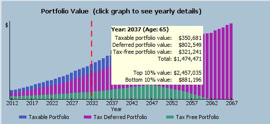
The bar chart on the left-hand side of the results panel displays the median portfolio balance for each year in the simulation. Each bar in the graph can be tri-colored to represent the taxable, tax deferred, and tax free components of the portfolio balance. You can move your mouse over the graph, to see the median portfolio balances for each year in the simulation as well as the bottom 10% and top 90% portfolio balances (see porfolio value bands below for details). Finally, for any year where the percent of expenses funded is below 75%, the vertical bars of the graph are made hollow, instead of solid, to show that planned spending had to be significantly reduced to preserve the portfolio.
One thing to keep in mind is that these balances represent the median balance from all 10000 simulation runs. This can be a bit misleading because this means half the time the retiree would have a smaller balance, and half the time they might have a larger balance. The bar chart doesn’t give an indication of the amount of variation between the worst case and best case scenarios (see portfolio value bands checkbox below).
Graph Controls
There are four checkbox controls just below the bar graph that allow additional information to be overlaid onto the graph. The first checkbox controls whether to show year-by-year data on the right-hand side of the graph panel. The default (unchecked) is to show a high-level summary for the simulation run. When this checkbox is selected, a vertical dashed red line appears and year-by-year data is displayed in more detail to the right of the graph. Clicking on different years in the graph area will cause the corresponding year’s data to be displayed.
The Show percent expenses funded checkbox controls whether a graph of the percent of expenses that were funded in each year of the plan is overlaid onto the graph. The percent expenses funded is related to the flexible and conservative Spending Policies. Although there are no y-axis labels shown for this value, you can see exact values year-to-year by also selecting the ‘show yearly results’ checkbox and clicking the graph to select years.
The Show failures checkbox controls whether to graph the number of failures (simulation trials where money ran out) that occurred in each year of the plan. This can show whether the plan tended to run out of money in the early years, or toward the end. Again, there are no y-axis labels for this item, but you can see the actual year-by-year values in the Detailed View Table (see below).
The Show portfolio value bands checkbox controls whether lines representing a range of possible portfolio values are drawn onto the graph. The year-by-year portfolio values shown on the bar chart and to the right are median portfolio values. The portfolio value bands try to capture a wider range of portfolio values that might occur. As an example, the bottom 10% portfolio value is chosen such that 90% of the simulation runs had a higher value and only 10% had a lower value. To use real numbers in our 10,000 run simulation, a bottom 10% value means that 1000 simulation runs had a lower value and 9000 simulation runs had a higher value.
Detailed View Table
If you’d like to see the complete output of a simulation run, click on the “Detailed View” tab at the top of the retirement planner window. This tab shows a table with simulation data for each year of the plan. You can click on the “show more details” radio button on the top right of the window to add additional columns of output data. Clicking on any column header of the detailed output table will sort the data in the table and right-clicking on any column header gives you options to hide/show columns in the table. Right-clicking on any cell in the table brings up a menu that allows you to print, copy to clipboard, or export the table data.
Finally, back on the summary view tab, you can click on the “Show All Runs” button to see data from priors run of the simulation. You can select any row in the table at the bottom of the window to show a graph for the selected run. Also, you can right-click on any row in the table and see the details of the selected run. As with the detailed results table, you can sort the data in the historical results window by clicking on any column header and you can also hide/show columns in the table.


