
Overview
The Flexible Retirement Planner’s Sensitivity Analysis tool helps you explore how sensitive or vulnerable your retirement plan may be to variations in input parameters, such as rate of return or annual retirement spending. The tool can be launched by clicking the Sensitivity Analysis button on the main planner window. It’s probably best to enter your plan’s details and run a few simulations from the main planner window before launching sensitivity analysis. Once you get your plan’s details configured and have explored the results a bit, the next step is to try some sensitivity analysis to see how changes in inputs might impact the results.
When you launch the Sensitivity Analysis popup window and click the Run Sensitivity Analysis button, a special type of graph called a heatmap is produced by running the planner’s Monte Carlo simulation engine hundreds of times using different input values for each run. Each cell in the heatmap represents a run of the simulation with unique input parameters.

Sensitivity Input Parameters
The simulation for each cell in the heatmap begins by first loading the inputs from the main planner page. Next, the appropriate values for the cell’s two sensitivity parameter inputs are written over those baseline inputs. These inputs are varied linearly from their minimum to maximum values as shown on the axes of the heatmap graph. You can edit the min/max values for each selected parameter with values appropriate for your plan.
Settings from the Additional Inputs window are always applied after the baseline inputs and the sensitivity inputs. Any rate specifications configured in Additional Inputs, such as portfolio return or inflation rate, will replace main planner inputs and sensitivity inputs in the years specified. Any cashflows entered at the bottom of the Additional Inputs window will be added in to cashflows from the main planner input window or from sensitivity analysis. This add-on or precedence behavior may interfere with attempts to do sensitivity analysis and might require some Additional Inputs settings to be disabled during sensitivity analysis. However, it can also be purposefully used to incorporate uneven cashflows such as one-time expenses or a terminal portfolio value into a sensitivity analysis run. (To test the probability of maintaining a given terminal portfolio value, enter the desired terminal value as a one year Other Expense cashflow at the end of the plan.)
There are over a dozen planner inputs that can be chosen for sensitivity analysis as shown in the Sensitivity Parameter dropdown menus. You can select any combination of these inputs for the 2 sensitivity parameters and they will be varied between their minimum and maximum values when the Run Sensitivity Analysis button is clicked.
The Return/Std. Dev. parameter is a special case where two planner inputs are combined into one Sensitivity Parameter and varied together. For this selection, both portfolio return and standard deviation are varied together linearly between their respective minimum and maximum values. Only the Return is shown on the graph axis, but the standard deviations that were used can be seen in the output table, or by clicking on individual cells of the heatmap. Portfolio Return and Standard deviation inputs can also be varied independently by selecting them separately in the drop down menus.
Sensitivity Analysis Output
As simulation runs are completed, cells in the heatmap are colored in based on the results. The values used for Sensitivity Parameter 1 are displayed along the x axis of the heatmap and the values used for Sensitivity Parameter 2 are placed along the Y axis. Each cell in the heatmap represents a simulation run using values for the 2 input parameters as indicated by the cell’s x and y position on the heatmap.
Each cell’s color is based on how robust the cell’s simulation result was, compared to results from other simulation runs. By default, the cells of the map are colored based on their simulation’s Probability of Success output. However, the Output to Graph can be changed using the control at the bottom of the graph. Cells representing simulation runs with the best results are green, while cells corresponding to simulation runs with the worst results are red or have no color (background color). Overall, cell colors transition from no color, to red, to yellow, to green as the relative strength of a cell’s simulation result gets closer to the best result for the entire heatmap.
Heatmap Controls
The first control below the graph area is Output to Graph, which determines the simulation output that’s used to generate the heatmap. When Output to Graph is set to either Probability of Success or Average Spending Shortfall, the minimum and maximum value range used to determine cell colors is hardcoded at 0-100%. When Output to Graph is set to other outputs, such as a dollar amount outputs like Median Portfolio Value, the minimum and maximum range used to determine cell colors is taken from the output data.
One side effect of this is that when the color scale is based on the min and max values from the output data, result values associated with red and green cells are relative rather than absolute. This may result in cells changing color while the initial sensitivity analysis is running and the heatmap is being drawn for the first time. This is because the min and max values used to determine cell colors may be changing as more simulation runs are completed. Another example of how this can be confusing is the case where the output being graphed only varies by a small percentage across all simulation runs in the analysis. Even though some cells will be red and some will be green, the actual output values may be relatively close together, despite their dramatically different colors.
The next graph control is the Color Transition Levels control, which determines the transition levels between the colors used in the heatmap. These transition points represent percentages between the minimum and maximum values of the selected output from all the simulations in the analysis. The default is that the red transition occurs when values are about halfway between the min and max. By default, the green transition occurs for output values about 90% of the way between the min value and the max value.
In general, the cells of the graph transition between no color (background), red, yellow, and green as the cell’s output gets relatively more robust. If the lower transition level is set to zero, all the no-color cells will instead be painted red. If the green transition level is set to the max, nearly all the green cells will be changed to yellow.
Sensitivity Analysis Settings
Three sensitivity analysis settings can be accessed by clicking on the Settings button at the top-right corner of the sensitivity analysis window.

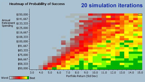
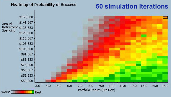
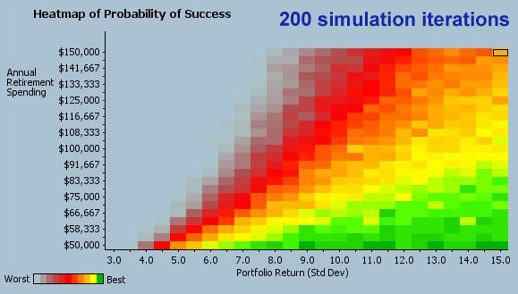
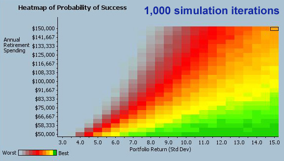
The Simulation Iterations setting adjusts the number of iterations that are used each time the simulation is run for sensitivity analysis. In a perfect world, each of the hundreds of simulations used for sensitivity analysis would run 10s of thousands of iterations to be sure that it converges the result. Unfortunately, doing 10s of thousands of simulation iterations for each of hundreds of different simulations would take a very long time on most personal computers. So the goal with this setting is to let users strike a balance between acceptable performance and fully converging on a result. Fortunately with the heatmap, unlike with the main simulation, it’s relatively easy to see whether the number of iterations selected was adequate just by looking at the shading of the cells in the heatmap. The more out of place colored cells that appear on the heatmap, the more likely it is that too few simulation iterations were used.
The slideshow below demonstrates the extremes of this by showing heatmaps that were generated with Simulation Iterations ranging from 20 to 50,000. Each of the heatmaps below was generated with the same inputs. The only difference between them was the number of simulation iterations used during the analysis. You can see from the images that running less than 1,000 iterations tends to yield an unconverged result. Running anything over 10,000 iterations tends to yield a highly converged result. Iteration settings between 1k and 10k yield a result that’s reasonably well converged, though not perfectly.


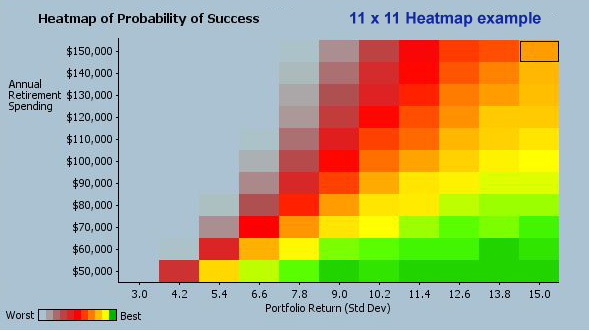
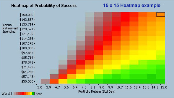
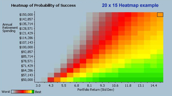
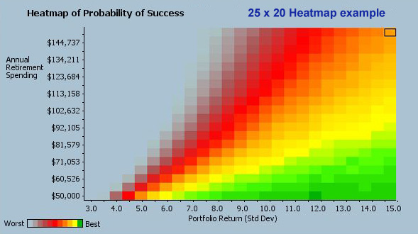
The next two sensitivity settings control the number of variations or steps that are used to transition the two input parameters from their minimum to maximum values on the heatmap. These two settings together determine the resolution of the heatmap and the number of simulation runs required to fill in all of its cells. The Parameter 1 Variations setting determines the resolution along the x axis or the number of heatmap cells across the map, while the Parameter 2 Variations setting determines the resolution along the y axis and how many cells high the map is.
The slideshow below shows the heatmaps that result from a few combinations of settings for Parameter 1 Variations and Parameter 2 Variations.


Tips for viewing heatmap details
- Clicking on a cell in the map causes the information from the corresponding run of the simulation to appear in the right-hand panel and to be selected in the table at the bottom of the screen.
- Double clicking on a cell launches a popup window with year-to-year details of the cell’s simulation run.
- The arrow keys can be used to traverse between cells as long as the heatmap has keyboard focus, as indicated by a dark outline around the selected cell. The heatmap gets keyboard focus whenever the mouse is clicked on a cell and will retain focus until the mouse is moved outside of the heatmap area.